5 Shelf Styling Tips from Dallas Interior Designers
Tip #1: Learn to Count
I know, I know. My apologies for the pithy title. This isn’t Peppa Pig (but now I’m singing the theme song too.) But “vary up the number of accessory groups on each shelf” just didn’t have the same ring to it. Nor is it an easy concept to explain. So here’s my best attempt to use words to describe what is, inherently, a visual thing.
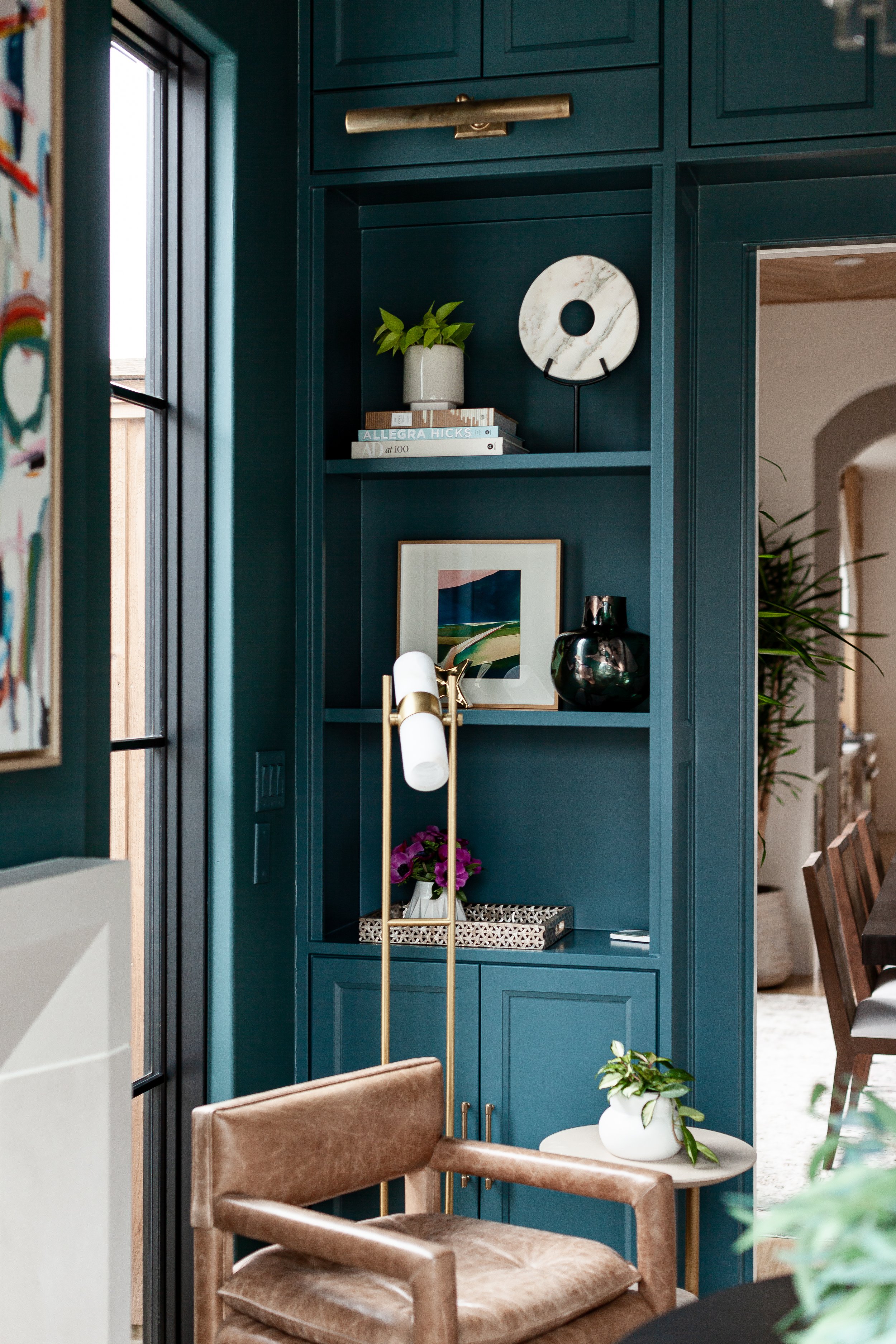
As we style shelves, we tend to cluster objects into groups. Our goal is to never have the same number of “accessory groups” on adjacent shelves. So where you likely see a bunch of pretty items in the photo below:
What we see looks a little more like this:
When styling the shelves above, we very intentionally put different numbers of “accessory groups” on the shelves right next to each other. This works kind of like layering does — providing a visual depth that allows your eye to travel over the space organically. And, yes, I know I’m sounding a lot like the guy on Instagram that says meaningless phrases in the name of “interior design.” But it’s a real thing! I promise! And it will make your shelf styling at least 50% better!
Tip #2: Layer Accessories to Create Depth
This is the number one mistake I see in shelf styling: novice shelf-stylers put everything on the same horizontal plane. Layering your accessories creates visual interest and prevents your shelf styling from falling flat. Our favorite accessories for layering are small framed art (like we used below), small mirrors, or using a beautiful book and turning it cover-side out.
Bonus tip: thrift stores and flea markets are great spots to find unique, inexpensive art for layering.
Bonus bonus tip: to achieve the perfect lean for a piece of art in the back of a shelf— without worrying about it falling — use clear command hooks to hold it in place at the base.
An example of layering art in the back of a shelf to create depth when shelf-styling by Lark Interiors.
Tip #3: Books are Your Best Accessory
This may sound obvious since we are talking about styling bookshelves, but books are your shelf-styling best friend. On their own, they can be used horizontally, vertically, or even cover side out. Accessorize them with book ends for added personality. (A note on bookends - don’t feel pressured to use both book-ends in the same spot. We often break a pair up.)
But the best thing about books is that they can be used to vary the height of the other objects on the shelves — acting like a little platform to give a smaller object more visual weight. Think of them like a great pair of heels on a petite person. They elevate everything. The plant in the photo below is a great example. Alone, the plant felt dinky in the space. But grounded by a couple of big coffee table books, it can totally hold it’s own, even on a high shelf.
An example of using books to vary the height of other accessories on the shelf while shelf-styling. Design by Lark Interiors.
Tip #4: Use Collected, Personal Items in your Shelf Styling
That shell you found on your honeymoon? The pocket watch from your great-grandfather? This is the place to display it! We love when clients have collected items we can include in their shelf styling. Not only does it make the space more personal, but it makes it more interesting. Anyone can grab a bunch of vases and candlesticks from Homegoods. Here’s a great example where client’s collection of items really added to the overall style of the shelves:
Shelf styling by Lark Interiors
Tip #5: Embrace Negative Space
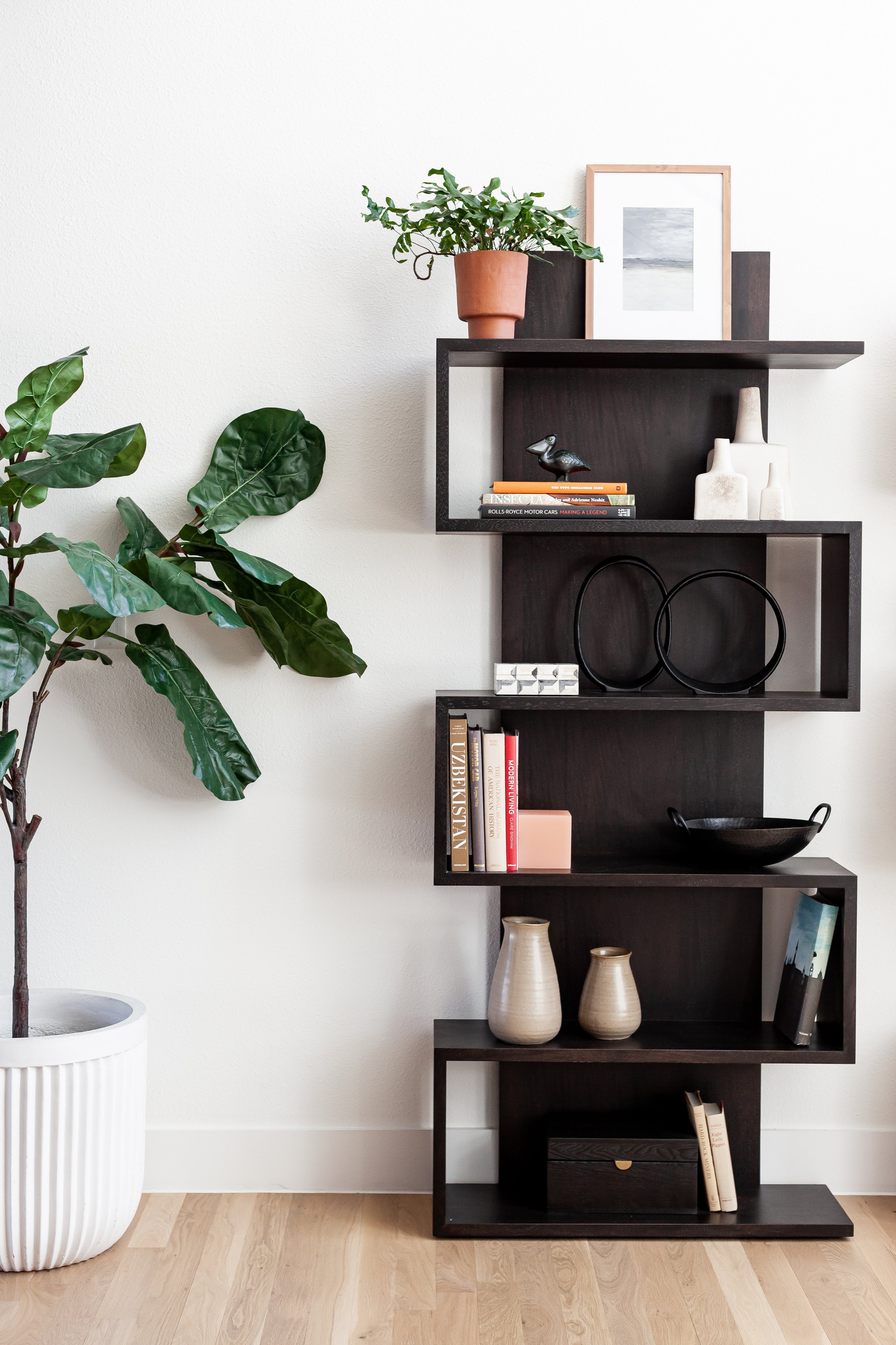
Don’t feel obligated to fill ever nook and cranny of your shelves. To lean into a cliche: sometimes a little dab will do ya.
An example of using negative space in shelf-styling. Design by Lark Interiors.
What’s our very best design tip?
What’s the very best design tip of all? Hire an interior designer! Interior designers can save you money, time, and your sanity. Learn more from the blog post linked below.


